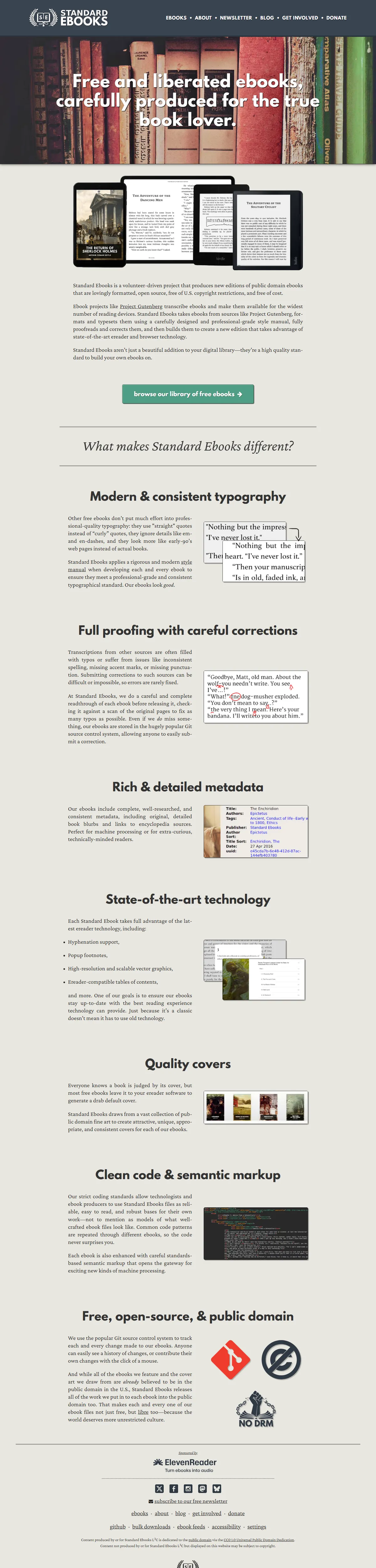
The banner is a shelf of worn hardbacks; the promise underneath is “free and liberated ebooks, carefully produced for the true book lover,” and the rest of the page is proof by example. Before-and-after snippets show straight quotes healed into curly ones and a proofreader’s red pen catching a dropped word. Each section heading — typography, proofing, metadata, covers — is a small manifesto set in serious serif type.
What earns the save is the coherence of craft and cause. A project about doing typography properly cannot afford sloppy typography, and there is none: generous measures, patient line-height, public-domain fine art pressed into consistent cover frames. It ends with Git repositories and a NO DRM stamp — the whole operation transparent, principled, and quietly beautiful. Reader software comes and goes; this is the standard the files deserve.